With Sony’s recent emphasis on full-frame cameras and lenses, many users of Sony’s original APS-C E-mount cameras have begun to feel a bit left out. While Sony still has a long way to go with regards to native APS-C lens selection, the APS-C camera line got another injection of technology with the brand-new a6400. While many await a ‘pro-grade’ APS-C body (akin to an A9 in APS-C clothing), the a6400 sits right between two of the now four 6000 series cameras in the APS-C line. While the a6400 lacks the in-body image stabilization and a few features of the ‘higher-end’ a6500, it carves out its own niche very nicely with a brand new autofocus system and a ton of great features at a reasonable $899 price point. In this review, I’ll examine the a6400 to see who this camera is for, and where it fits into the greater Sony ecosystem.

If you’re not familiar with my reviews, I review from a real world shooting perspective. You won’t find lens charts or resolution numbers here. There are plenty of other sites that cover those. I review products on how they act for me as a photographic tool. I am not a videographer, so my reviews concentrate on the still imaging capabilities of a camera.
Construction and Handling
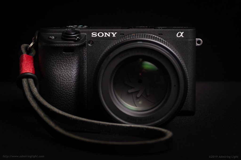
The a6400 is Sony’s fourth model in the 6000 series cameras, following the a6000, a6300 and a6500. All four of the cameras in this series share essentially the same general body design and size, with minor differences here and there, with the biggest being the a6500’s larger grip and additional custom function button. It seems Sony has found a form factor they like for their APS-C bodies, and is sticking with it. For the most part, that’s not a bad thing, as the a6400 continues to be a body that is generally comfortable to handle, while providing easy reach to the controls and an extremely compact form factor.
The a6400 from the exterior is most like the a6300. In fact, aside from the C2 button being labeled differently and the ‘a6400’ logo, they look identical when the rear screen is closed. The result is a camera that will be instantly familiar to those upgrading from an a6300 or a6000. The camera is constructed of lightweight magnesium alloy, and feels solid in the hand. With that said, you can tell that the magnesium alloy frame is rather thin, and is not quite as robust as something like the A7 III. Supposedly, the camera features some level of dust and moisture resistant weather sealing, though I wouldn’t trust the camera in a downpour, as the accessory port door and the battery door both lack any sort of gasketing. The front grip is relatively pronounced for such a small camera, and as such the handling is reasonably good with a few caveats.
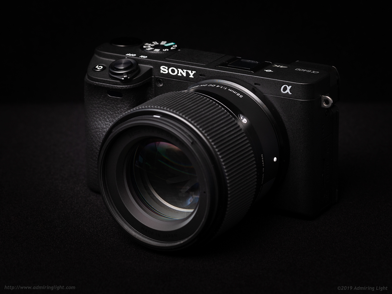
The camera is comfortable to hold when using smaller lenses, though I still think Sony could make a few tweaks to make it even better. First, I would prefer the more rounded grip of the a6500, as the flat front grip of the a6400 is slightly awkward as it forces your fingertips up against the lens mount. The second item, which would alleviate that issue, is that I wish they would make the body just a bit wider to allow for more space between the grip and lens mount. That little extra space would just let the camera settle into the hand better. The current design can lead to your fingers feeling cramped between the grip and an attached lens. As is common with small mirrorless cameras, your pinky will dangle off the bottom of the grip, but I’m used to that by now.
The rear of the camera has the same sculpted thumb rest that is nicely contoured to provide comfort and control on the rear of the camera. The control dials and buttons are all within easy reach of your index finger or thumb, with a slight exception for the video record button, which sits to the right of the thumb rest. It’s accessible enough, but because it requires you to remove your thumb entirely from the rear of the camera, and press in on the side a bit, it’s a move best done while supporting the camera with your left hand.
The new rear screen, which can tilt up and down as well as flip forward 180 degrees for viewing while shooting selfies or for vlogging, is quite nice to use, and the mechanism that holds this screen is sturdy despite the triple-hinge design. The flimsiness of the screen was one of the things I knocked about the a6000, so it’s nice to see a notably more robust construction on the later 6000 series cameras.
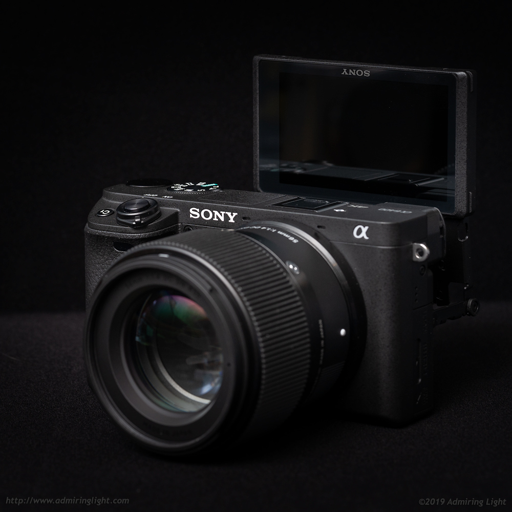
I also found that while the screen mechanism is primarily designed for the forward shooting capability, it was advantageous for regular shooting as well, as it enables the screen to be pulled further away from the body, which can be helpful in some situations. Another advantage of the new hinge design is that it allows the screen to tilt downward further than on previous models, which were limited to a 45 degree downward tilt. The a6400 can tilt downward around 80 degrees, making shooting with the camera over your head more natural in more situations. Getting the mechanism to face forward can be a little awkward at first, but I quickly became accustomed to it.
Controls and Operation
As mentioned earlier, the a6400 borrows the control scheme almost directly from the a6300, with one key difference that I’ll get to in a moment.
The top of the a6400 features the shutter button on the front grip, which is surrounded by the power switch, allowing for easy access to turn the camera on and off. Next to the shutter button sits the C1 button, which is one of many programmable buttons on the camera and can be set to a multitude of functions. Like most of my cameras, I have this button set to enable magnification of the focus area, either for more precise autofocus or to aid in manual focus.
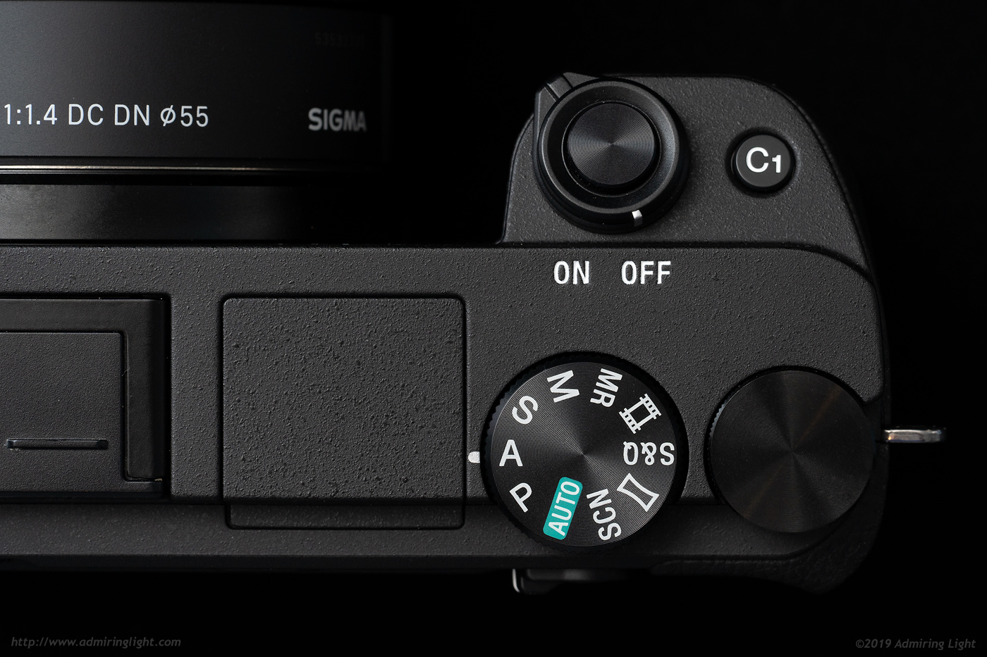
Behind these buttons sits a standard PASM mode dial and the main thumb dial, which can be used to change exposure parameters. This control is also programmable, though I have it set to change aperture (in aperture priority and manual modes) and shutter speed (in shutter priority mode).
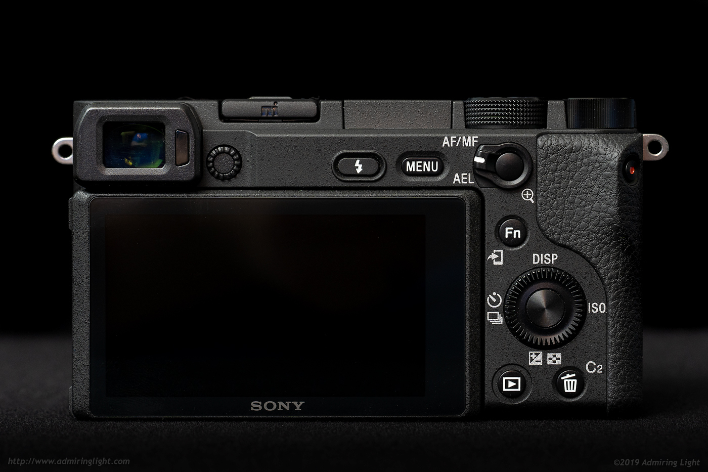
The rear of the camera is also identical to the a6300, and extremely similar to the a6000. Coming from an a6000, the biggest change is the addition of the two-way switch, which changes the function of the button in the center of the switch depending on switch position. These default to AF/MF toggle and Exposure lock. To the left of the switch sits the menu button and the internal flash release button.
Below the two-way switch is the now ubiquitous Fn menu button, which brings up a quick menu of 12 functions for easy access. The Fn menu is fully programmable for your shooting preferences. Below the Fn button sits the rear dial, which can be programmed to operate other exposure parameters. I use it for exposure compensation. The dial can be pressed for four additional functions, which default to display, ISO, drive mode and exposure compensation, though they can be programmed to access any function you want. Below this dial are two additional buttons: one for image playback, and yet another programmable button. Finally, the movie record button (which is also programmable) sits to the right of the thumb grip.
With the large number of programmable buttons and dials, the camera can be set up to suit each individual shooter, though getting it set up can be a somewhat time-consuming process. The Sony menu system is the same as in the A7 Mark III series bodies, and is still extremely detailed and huge, which can make it difficult to find a particular setting. Thankfully, the ‘My Menu’ feature is also here, which allows the photographer to set the most accessed items to a custom menu for easy access. The sheer number of settings in the menus can be particularly daunting for new photographers or those new to Sony, but after initial setup, the camera becomes easy to operate, with quick access to a surprisingly large number of features.
With all that said, I do wish Sony would have finally added a third dial to the camera. Simply adding the front dial from the A7 series cameras would improve general usability a lot, and would make it so that the three exposure parameters for any mode could have instant access via dial, rather than relegating one of them to a button press and then using the rear dial.

The one big change to the operation of the a6400 is the long-overdue addition of a touch screen to the 6000 series cameras. The a6400’s touch screen allows for tapping to move the focus point, swiping through and pinching to zoom images during review, and using the screen as a touch pad to move the focus point while using the EVF. This last feature is probably the biggest usability upgrade with the camera, as Sony has calibrated the touch pad functionality very well, making it easy to position focus points with the EVF to your eye, and much easier than using the other method of moving focus points. That alternate method involves enabling movement with a button, then moving it via the four-way functionality of the rear dial. This method is bizarrely different from other Sony cameras, as when you press the button to move focus points, the point movement stays active even after a half-press of the shutter button. This can be a bit handy in some cases, but I find it a little annoying.
While the touch pad ability adds a quicker way to move focus points, even better would be the addition of a focus joystick, which is making its way to more and more cameras. Sony could dramatically increase usability of the camera by making three changes: Move the grip about a half centimeter to a centimeter further away from the lens mount; use the extra space from that width by adding a focus joystick, and add a dial under the shutter button on the front grip.
One final note: if anyone knows how to get the ‘move focus point’ reminder hint on the screen to go away, that would be helpful. It’s unnecessary and distracting.



Leave a Reply