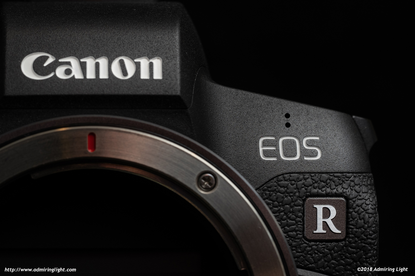
This has been a big year for the mirrorless industry, as the two big boys, Canon and Nikon have both thrown themselves into the Full-Frame mirrorless world to give Sony some competition. The EOS R is Canon’s first entry into this space, and it comes with their new RF mirrorless mount. Canon made some very good choices with this body, while making other choices that make me scratch my head. I’ve spent a fair bit of time with the EOS R, shooting primarily with the RF 24-105mm f/4 (review coming soon), along with a few EF mount lenses that I own using Canon’s basic EF to RF adapter. As this camera is the cornerstone of an entirely new system, I’ll also spend a bit of time talking about the system as it currently stands, and where I see Canon moving forward with the RF cameras. I’ll also talk a bit about where the EOS R fits in with its rivals in the full-frame mirrorless space.
If you’re not familiar with my reviews, I review from a real world shooting perspective. You won’t find lens charts or resolution numbers here. There are plenty of other sites that cover those. I review products on how they act for me as a photographic tool. I am not a videographer, so my reviews concentrate on the still imaging capabilities of a camera.
EOS R – A new beginning for Canon
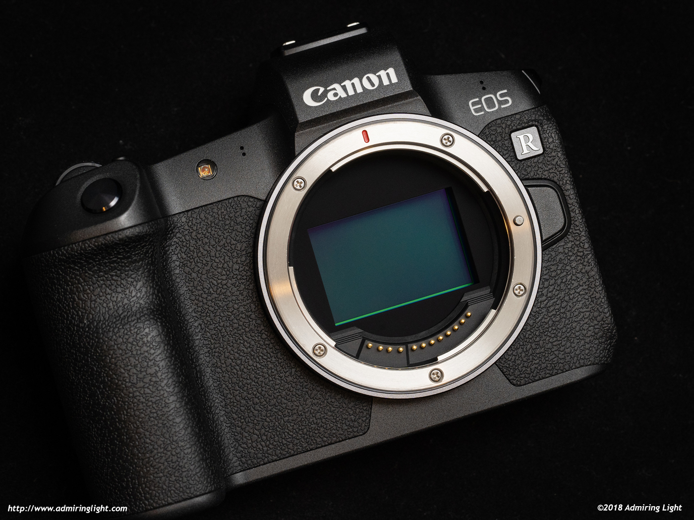
The EOS R is the first camera with their new RF lens mount, which takes what Canon learned from the EF mount, redefines the flange distance and adds a few pins for some additional functionality. The EOS R is to the RF mount what the original EOS 650 was to the EF mount. Canon also has their APS-C specific EM mount, but Canon never really seemed to take APS-C mirrorless seriously, while this time around the RF mount appears to be something they are going to commit heavily to.
The first evidence of that is the starting lens lineup. Canon is targeting the high-end with their initial lens releases, with four total lenses, 3 of which are designated as their top end ‘L’ lenses. The initial lineup consists of the RF 35mm f/1.8 STM Macro, the RF 24-105mm f/4L IS, the RF 28-70mm f/2L, and the RF 50mm f/1.2L. The three L series lenses are rather large, with the 24-105mm being a chunky lens, the 50mm f/1.2L being very large, and significantly larger than its EF counterpart (though also said to be notably better than the EF version), and the absolutely monstrous 28-70mm f/2L, creating the world’s first f/2 standard zoom lens for full-frame bodies. Canon is definitely taking aim at the top of the market, which also makes some of the design decisions on the EOS R a bit puzzling, but we’ll get to that throughout the review.
The EOS R doesn’t enter the market in a leading position, however, as it has Nikon’s new Z6 camera to compete against, as well as Sony’s excellent A7 III in a similar price bracket. Canon also doesn’t have an RF body to yet compete with Nikon’s Z7, or Sony’s A7R III or A9. Given the brand recognition of Canon, I think they will be OK letting that portion of the market wait a little, but it’s very early in this market segment, so a lot remains to be seen.
Construction and Handling
The EOS R is a bit larger than your average mirrorless camera, with a substantial grip, ample width and a little more height than Sony’s full frame bodies. The extra size makes the EOS R feel somewhat like a small DSLR, but in absolute terms, it’s not that much larger overall than something like the Sony A7 III. Ultimately, it’ll fit generally where Sony’s cameras fit. The body is constructed of a mix of magnesium alloy and high quality plastics, and it feels lighter than it looks when you first pick it up.
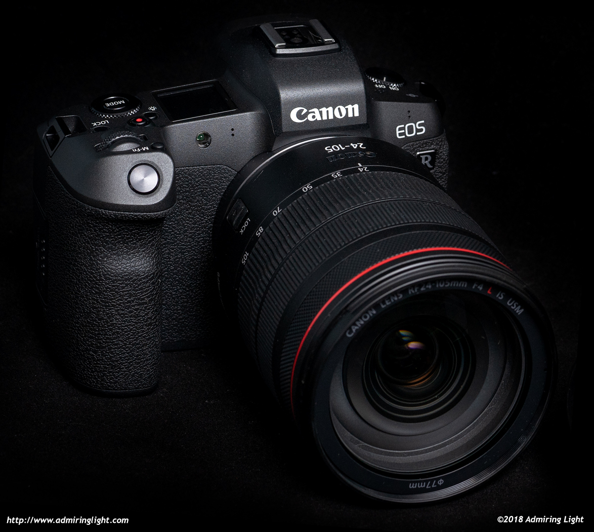
The body has no flex it in anywhere and feels quite solid in the hand. Canon has designed the body such that the shutter button actually sits slightly higher than the rest of the camera top, keeping the overall size in check, but providing a hand grip that comfortably fits your entire hand. The deep, comfortable grip is one of the EOS R’s best features, and makes for a very pleasant shooting experience with minimal fatigue after a long shoot. The front grip is sculpted perfectly, and the rear grip also is quite nice, but isn’t quite as form-fitting as the front. Canon has placed most of the buttons and dials on the right side of the body, and all are easily accessible with your thumb or index finger.
One small gripe I have about handling is that the tactile feedback of the buttons is all over the map on this camera. The M-Fn button is small with almost a hard snap activation, some of the buttons are very mushy, and others have a nice tactile feel. The four-way controller has some tactility, but also extremely short travel, and I didn’t generally like the feel. I wish there was some level of consistency in how these buttons felt, but it ultimately is a minor thing.
While I have a few issues with the control layout, which I’ll get to next, the camera feels great to use, and is pleasant whether using the 24-105mm zoom or something larger like a 100-400mm.
Operation and Controls
This section is one where I’m the most split, and it’s going to be long. There are some excellent things Canon has done with regards to camera operation, along with some boneheaded decisions that bugged me throughout my time with the camera.
Canon has had a fairly familiar control system for their DSLRs for years and years, with subtle refinements in their control schemes. Typically, Canon DSLRs have had a front dial that sits above the shutter button, and a large wheel that sits on the rear of the camera. Prosumer and professional models have typically had a joystick control to move focus points around the viewfinder, along with the usual assortment of buttons, and a PASM mode dial on top. Additional controls and tweaks have changed over the years, and the 1D series of cameras differs a bit (and has for decades) by requiring two-handed changes (press a button and then move the wheels) and removing the PASM dial, but overall, these have been the basic controls since way back with the 30D and 5D.
So what did Canon do, to make it comfortable for long time Canon users to move to mirrorless? Why they threw that paradigm out the window and started fresh! Now, a new system is a decent time to shake up controls, and Canon did keep some aspects familiar, such as the shape and feel of the shutter button and subsequent position of the front dial above the shutter button. Those will feel instantly familiar to the Canon shooter. The rest, however, is a fairly big departure.
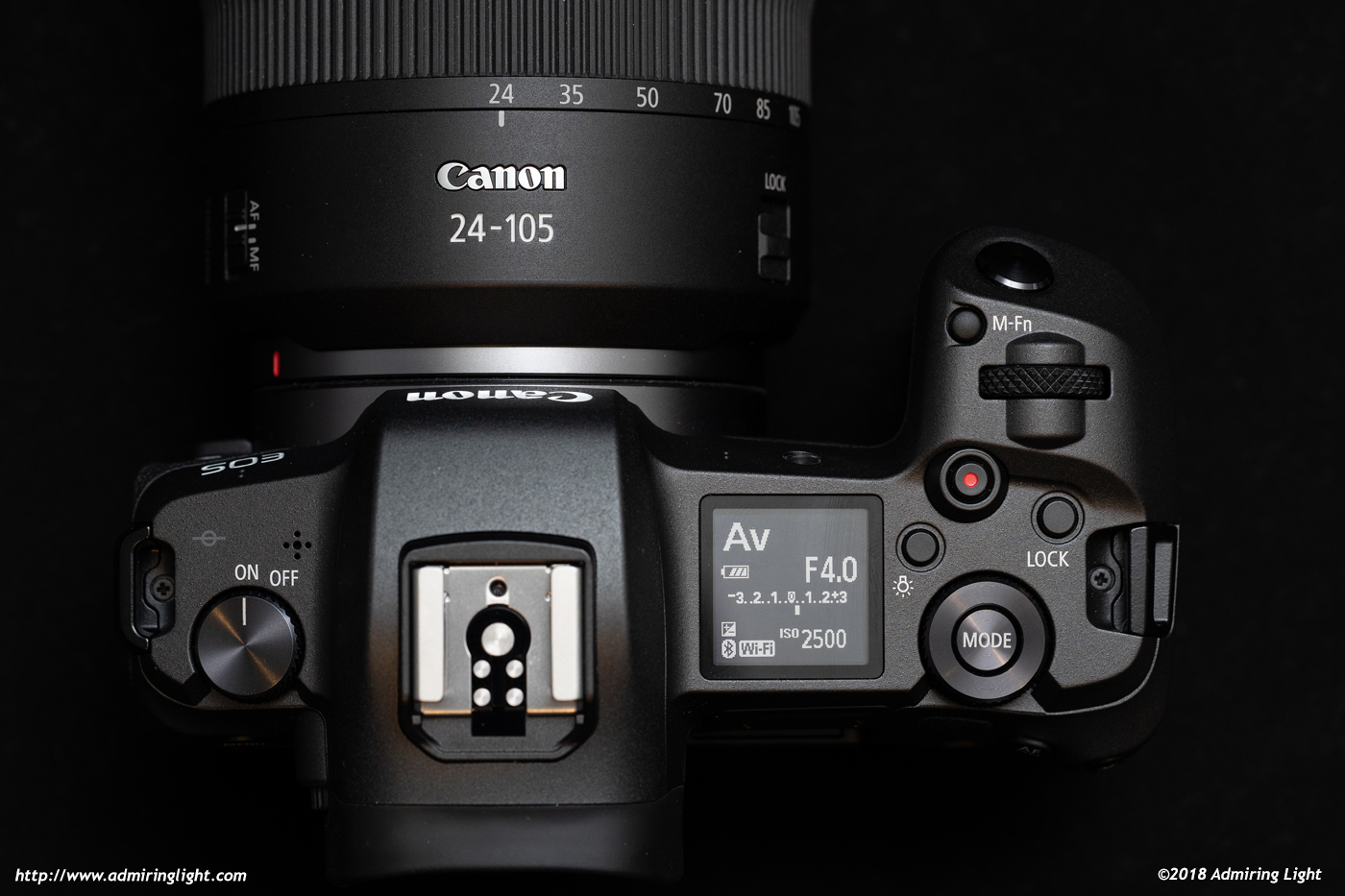
The EOS R’s top features the aforementioned shutter button and front (main) dial, plus an M-Fn button, a Lock button, the movie record button, the top LCD display and the combination mode and top rear (control) dial. The M-Fn button can be pressed and then the dials used to change parameters such as drive mode, white balance, etc. The lock button locks all controls until pressed again to prevent accidental changing. The top of the control dial has a mode button. Press the mode button and operate the dial (or use the touch screen) to change the shooting mode.
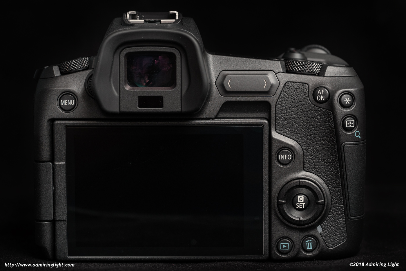
The rear of the camera features several programmable function buttons, a four-way controller and a touch sensitive multifunction control bar and the rear touch screen. The center of the four-way controller has a Set and Quick menu button that usually brings up the camera’s quick menu to allow for the changing of several key components. Unfortunately, though, this menu is not customizable, unlike similar menus on Sony and Fujifilm cameras.
There is no joystick, no dial on the back of the camera, and in its place is that touch bar. I’ll get into that control in a bit. There is another important control that resides on each RF lens and one of the EF lens adapters, and that’s the lens control ring, which is a clicky rotating ring that you can assign to any number of functions.
The lens ring is a really neat idea, and it works pretty well. I do really like its inclusion in the system. However, I think the placement on the lens is problematic. My first inclination was to use it for aperture control, as I’m used to using an aperture ring from many manual focus lenses as well as most of the Fujifilm XF lenses. However, the location of the ring at the very front of the lens made it awkward to use as an aperture control on a lens the size of the 24-105mm. It’s just too far forward, and requires shuffling my left hand from its normal spot under the center of the lens near the zoom ring in order to operate it. I wish Canon had placed the control ring on the lenses in the same general position that it sits when using the control ring EF to RF adapter, at the base of the lens where most aperture rings sit.
Eventually I sort of gave up on it for aperture control. I thought about using it for ISO, because I typically have the third programmable dial on cameras that have three dials to control ISO, but I really didn’t want a control like ISO to be accidentally changed by bumping the lens or rubbing it against something. I settled on setting exposure compensation to it, primarily for using the new Fv shooting mode (which, again I’ll discuss shortly), but otherwise I sort of ignored it.
Now let’s talk about the touch sensitive multifunction bar and the lack of a joystick, and start with the lack of a joystick. I missed it a lot when using this camera. As I’ll discuss in a bit, the touch screen is great on the EOS R, and does allow you to touch to set focus point. When the viewfinder is to your eye, however, you have to use the touch screen as a touch pad to move the focus point.
I’m familiar with this mechanic, as other cameras I own, the Olympus E-M10 Mark II and Fujifilm X-T20, utilize the same mechanic. It works fine, I guess, but it doesn’t offer the same level of tactility and immediacy of a dedicated joystick. Canon’s implementation also requires rather large movements to shift the point significantly, so that I often had to do multiple swipes to get the point where I wanted. You can also press the focus point button and move the AF point with the four-way controller, and I often found that to be the better way. Both ways, however, are worse than if they’d just had a joystick.
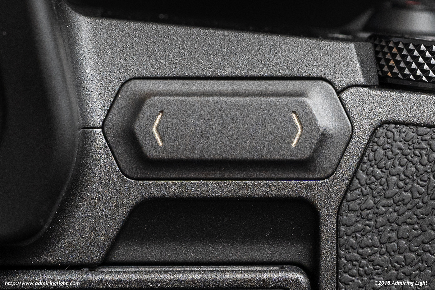
This brings us to the multifunction touch bar. I hate this control. I loathe this control. I found it to be the single worst camera control interface ever to be put on a serious camera. It’s awful. The M-fn bar is a hard touch sensitive bar that has two areas of interaction, a left and right arrow, which you can individually press, or you can swipe along it to change settings. You can change this bar to operate several different settings, but I typically used it with ISO. You can set the bar to operate instantly when touched, or to lock automatically after a few seconds, after which you must rest your finger on the left arrow for a few seconds, which will unlock the bar and cause it to be operational again.
I hate everything about the ways this control operates. When using the lock mechanism, the control is exceptionally slow to use and awkward to activate, so I turned it off after a single day of leaving it on. I didn’t have too many issues with accidentally changing settings on the bar, but it did happen on a few occasions. However, the biggest issues I have with the bar is the complete lack of tactile feedback, the relatively slow and laggy operation and odd behavior that would sometimes cause touches to not actually change a setting, or I’d find some things harder to change (often, switching from a set ISO to Auto ISO was met with some sort of software stop when swiping to get to the Auto setting…it was bizarre).
In all, it was frustrating to use every time I used it. And luckily, the weather was nice when I was shooting with the EOS R. In winter, unless you have excellent capacitive gloves that are form-fitting (so you don’t accidentally brush it), you can’t use this control at all with gloves. Why, Canon? Why couldn’t you have just given us another dial in that location? Or a focus joystick? And then another dial. Why?
Now that I’ve gotten that out of the way, let me talk about the good things Canon has done with the controls on this camera, because there are several.
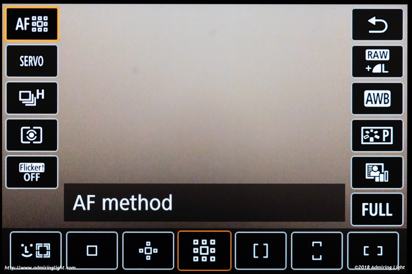
First, the touch screen implementation is absolutely fantastic. The touch screen operates exactly how a camera touch screen should operate. You can move focus points and take a picture like most cameras with touch screens, but the menu system is also completely touchable, and if something looks like you can touch it to operate a setting, you probably can. It makes going through menus, interacting with sub-menus from other dedicated buttons and reviewing images a breeze.
Second, the new Fv mode is excellent, and allows you to basically operate the camera in a ‘free auto’ mode, choosing which settings between ISO, shutter speed, aperture for the camera to handle, and which for the user to manually set. You can switch between exposure controls with the rear control dial, then change it with the main dial. Set all three to Auto for full auto mode. Set the aperture to basically be in aperture priority…but then you can choose a specific shutter speed and leave ISO on Auto, basically being in manual+AutoISO. It basically gives you on-the-fly access to all autoexposure modes as well as manual, all in the same shooting mode, giving you a lot of versatility.
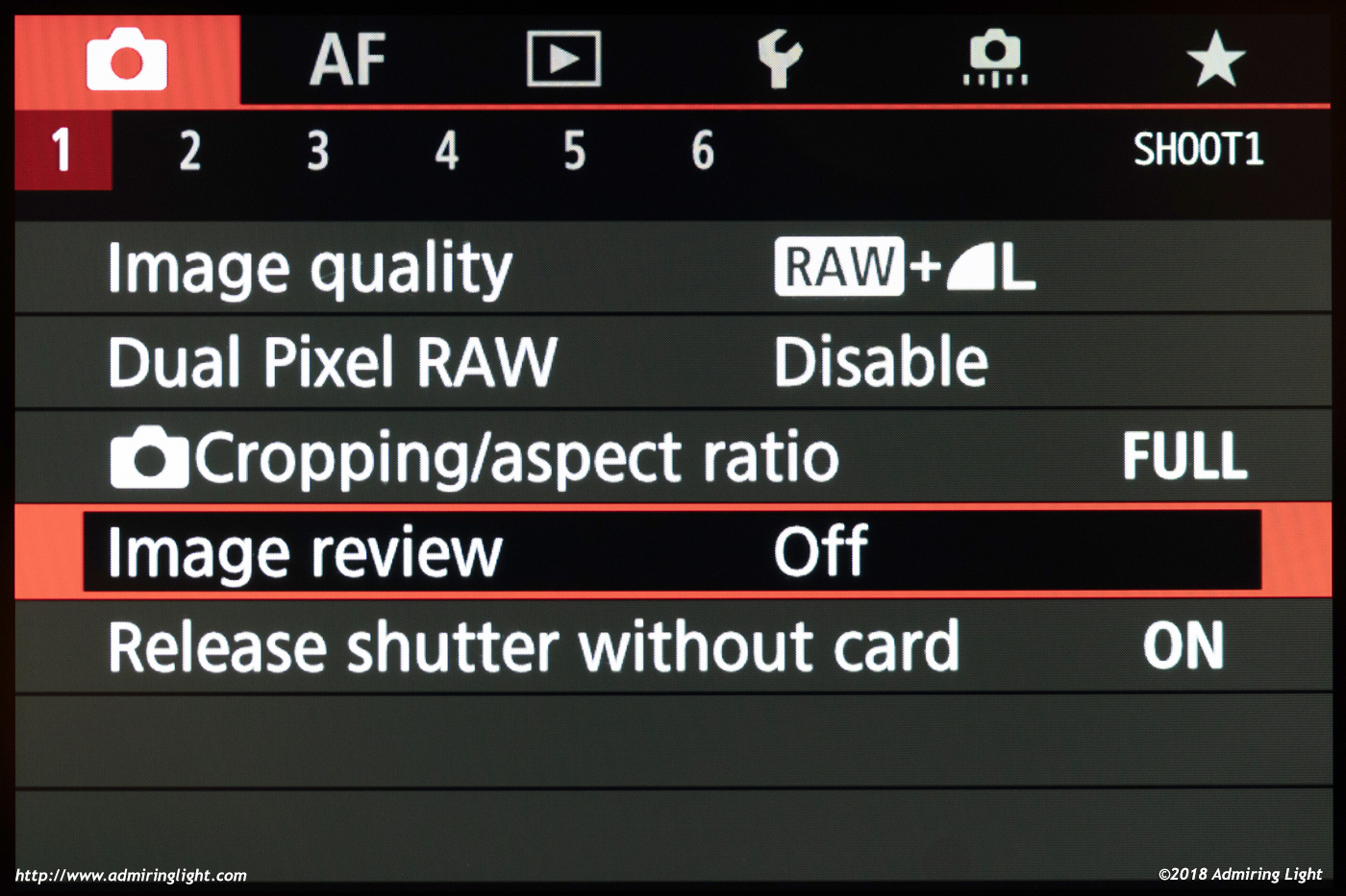
The Menu system of the EOS R is well-organized, and easy to navigate, either with the four-way buttons or the touch screen, and should be familiar to existing Canon shooters. Well done here.
In all, the controls on the EOS R are a mixed bag. There are some really good ideas, some standard ideas, and some really bad ideas, but the overall operation of the camera is relatively smooth, save for the M-Fn bar. I could go on for another page or two, getting deep in to the weeds of operation, but I think it’s time to move on.




Leave a Reply